
A restaurateur’s best bet in staying relevant in an era of rapidly updating trends is to constantly embrace change. This includes changing your restaurant or cafe space, your kitchen, your decor, and, of course, your menu.
This latter part of your business is easier to update than the other aspects, which is perhaps why restaurant menu design ideas change almost every year. Here’s a roundup of 2023’s menu design templates so far, to help you stay on top of your game–at least as far as your menu is concerned.
1. Keep it simple
Just as it is with most designs, minimalism is in with menu templates in 2023.
Today, nobody is going to spend time pouring over lengthy descriptions and fancy item names on convoluted, noisy menu design; everyone is looking for convenience and a quick fix.
Your best bet, then, is to opt for a restaurant menu design that has just the bare essentials that communicate your brand identity and, of course, the menu items, descriptions and prices.
There’s no need for any fancy fonts, artistic photos of menu items, or descriptions filled with fluff.

Here’s an example of a minimal menu template. This charcoal-and-white design is reminiscent of the simplest of menu styles, a chalkboard propped up outside a restaurant.
Keep your menu design simple by sticking to a few easy-to-read fonts. As you can see in the template above, the use of only two fonts lends an air of simplicity and consistency to the menu.
The menu checks all the boxes for fonts and readability, and has zero unnecessary embellishments. While it’s not necessary for you to follow a monochromatic color scheme with your menu (as we will explore with other design trends), these are the basics of a minimalistic menu design.
2. Engineer your menu to the reader
One crucial element to learning modern menu design trends is to know the latest consumer psychology, and apply it to your menu design layout.
You might be surprised to know that people don’t actually scan menus from left-to-right, as is standard in reading English. Instead, they tend to follow the same principle as when reading a newspaper–focusing on the middle of the page first, then moving on to the left and right sides. This is known as the Golden Triangle.
What this tells you about your menu design is to place the most important stuff, or the items you want people to focus on/buy the most, in the center of the menu. Then, with decreasing priority, you can arrange other elements and items on the top, bottom, and sides.

This Thanksgiving menu template does a great job of just that.
The picture of a large, delectable turkey takes center-stage, with the rest of the information being distributed along the sides. Chances are anyone who’s reading will take a look at the information provided in the center and immediately be moved to make the decision to buy the item.
3. Draw attention to the important stuff
While using the reader’s psychology to manipulate menu layouts to your benefit is a good starting point, there are other ways to draw the reader’s attention to the good stuff by making a creative menu design.
One way is to emphasize popular items on the menu, or ones you want to sell. You can emphasize certain menu items in many different ways by making them stand out against the rest of the menu.
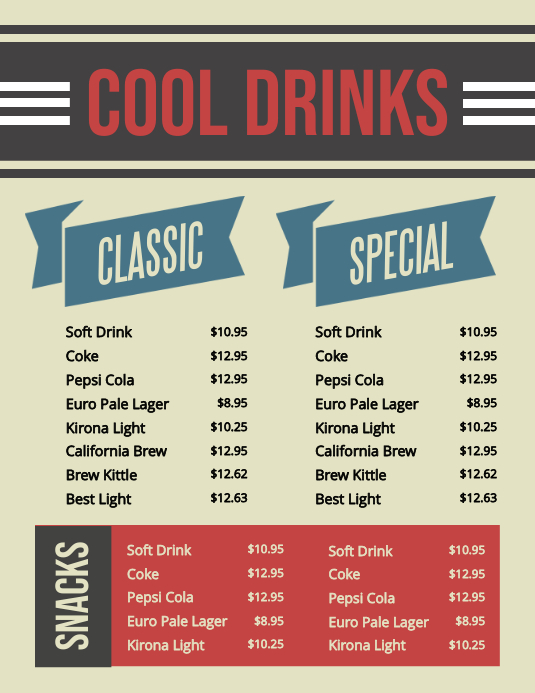
Boxes
Placing certain menu items in a different colored box can help you put a spotlight on them. This retro-themed menu template does exactly that with its snacks selection. The red box instantly makes this section of the menu stand out from the rest.
Labels and arrows
If you have a menu that has a lot of items, you can use labels and arrows to draw attention to the various categories. This loaded menu template illustrates how you can handle an item-heavy menu to avoid making it look overcrowded.

Spotlight menu item photos
Having photos of every menu item signifies a cheap restaurant to most readers. However, this doesn’t mean you should write off photos of menu items entirely. You can use one or a few tastefully captured photos as ‘spotlights’, to capture the reader’s attention.

This template skilfully combines boxes and a spotlight food image to create variety within the menu and highlight key areas.
4. Don’t shy away from sketches
While it’s not wrong to use real photos in your menu design (to a certain extent), there can be a number of reasons why this isn’t feasible. You might just not have the resources or equipment to take appetizing pictures of your items in good lighting. You might also not have the budget to hire someone for this, or even to use stock photos instead.
If this is the case, this new menu design trend is made for you.
Using sketches as a stand-in for actual pictures of your food, if done tastefully, can add a sleek, modern look to your menu.
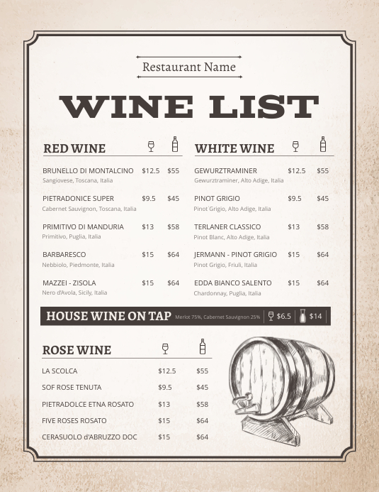
This wine list uses elegant yet minimal line art paired with a retro aesthetic to convey an overall message of vintage luxury that is appealing to the eye. If the menu had used actual pictures of the wines, chances are the end-result would not have been as impressive.
Here’s another example of a menu template using sketches.
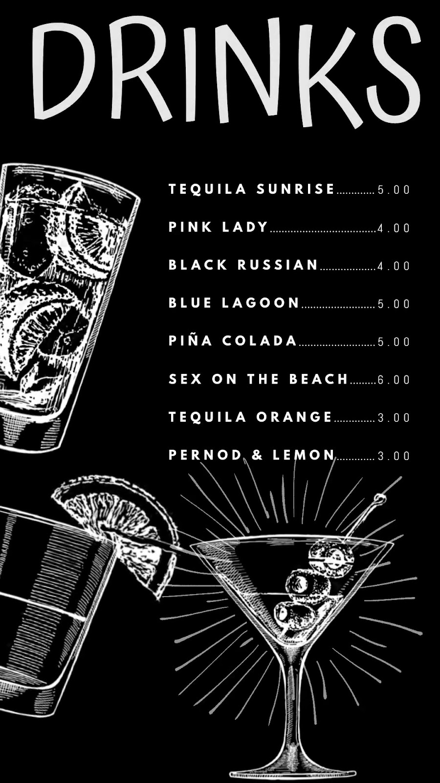
This drinks menu uses basic sketches of various cocktails in lieu of actual drinks photographs. The result is a mature menu design that conveys its message perfectly.
5. Use colors to your advantage
Recent restaurant marketing ideas and trends have favored monochromatic or dichromatic color schemes over a smattering of random colors, as the former tends to create a stronger sense of unity in design that the latter lacks. This can be seen in menu design trends as well.
Many menus prefer using red or blue hues, as these are meant to remind the reader of meat and water, triggering their appetite.

This menu template consists largely of a refreshing blue color, which conveys its central focus–a selection of chilled drinks–perfectly at first glance.

Similarly, the red accents on this menu dominate the design, and convey the idea of piping hot, spicy pizza, burgers, and other delicious items designed to make the readers’ mouth water. Not only this, but the strategically placed pops of color guide the eye to where it is supposed to go.
Blues and reds are not the only colors you can use to your advantage in a menu. Using brand colors on a menu is a smart way to create a cohesive brand identity that customers can resonate with.
Design your own menu today
With these latest menu design trends, you can try your hand at creating a scrumptious menu on your own. Try out PosterMyWall’s menu maker today and see what you can come up with!